

Overview
The objective of the project was to increase the usage of Maximum Credit Cards and the Maximum Mobile Application by identifying trends and user-oriented functions, as well as to encourage campaign participation.
The project involved collaboration with brand stakeholders and a skilled tech team to ensure that the site is optimized for mobile devices and designed with the customer experience in mind. The site utilizes clear language, attention-grabbing imagery, and simple forms with clear calls to action to motivate potential customers to apply for credit cards.
The site was designed to provide a positive user experience, building brand loyalty and driving conversions.
My Contribution
Research
Workshop Facilitation
Creative Concept
Wireframe
The Team
1 Product Manager
2 Product Designers
1 UI Designer
6 Engineers
Year
2021
Workshop
When it came time to design the Maximum credit card campaign site, the team recognized the importance of getting input and buy-in from key stakeholders. To that end, a client workshop was held that brought together 25 individuals with a diverse range of backgrounds and expertise. The workshop was held in a collaborative space that allowed for free-flowing ideas and open discussion.
The participants were split into smaller groups to discuss key topics such as user experience, branding, and technical requirements. Each group was tasked with generating ideas and sharing insights based on their respective areas of expertise. As the groups worked, a clear vision for the site began to emerge.
After several hours of brainstorming and collaboration, the groups came back together to share their findings and to refine the site's design based on the feedback received. The stakeholders' input was instrumental in shaping the site's overall look and feel, as well as its technical requirements.
Thanks to the client workshop, the team was able to develop a site that exceeded expectations and delivered results. The site was met with enthusiasm from both the client and the public, and the stakeholder buy-in was crucial to its success.
Workshop Outcome
Simple Navigation

Promoting Cards

Custom Campaigns

Boosting Traffic

Challenges
Information Architecture
The navigation system was generally effective, but there were areas where the information architecture could be improved. There could be more intuitive ways to organize the categories to make it easier for users.
SEO
Specifically, optimizing the on-page SEO elements, improving keyword targeting, and exploring opportunities for off-page SEO could increase the website's visibility and ultimately its success
Branding
While branding was certainly eye catching and attention grabbing, it was intense for some potential customers. The use of bold colors and striking typography can be effective in making a statement, but it's important to ensure that the overall branding also appeals to a wider audience.
Campaign
Campaigns increase brand awareness, acquire new customers, improve conversion rates, generate revenue, and retain existing customers. However, challenges such as competition, regulatory restrictions, and effective targeting need to be addressed.
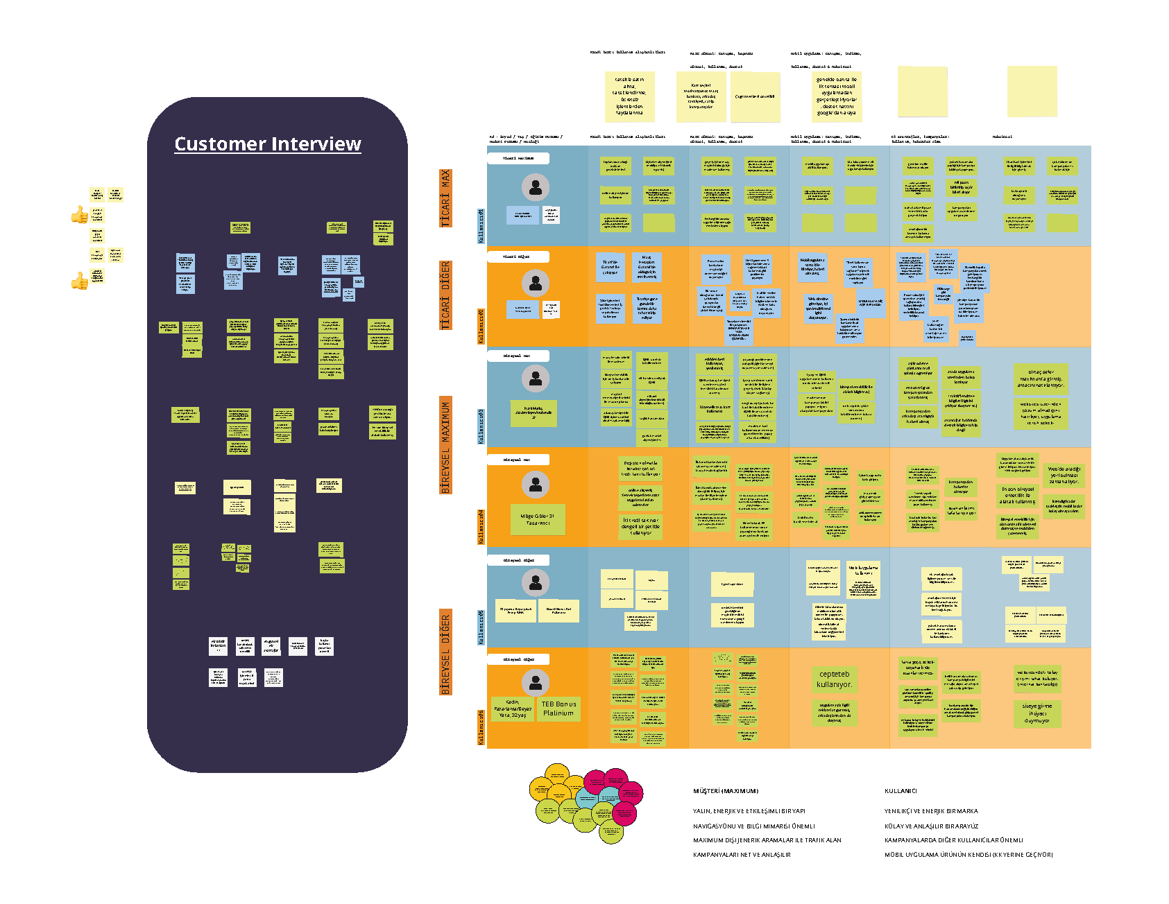
Research
To ensure that the Maximum credit card campaign site met the needs and preferences of its target audience, the team conducted user interviews with 36 individuals who had experience using credit cards. The participants represented a range of backgrounds, ages, and lifestyles.
The user interviews revealed several key insights. Firstly, the participants highlighted the importance of clear and concise language when presenting financial information. They also expressed a desire for straightforward navigation and easily accessible features that allowed them to manage their finances on-the-go.
In terms of design, the participants expressed a preference for simple and uncluttered layouts, with bold imagery and clear calls-to-action. The ability to personalize their online experience was also highlighted as an important feature.
Participants emphasized the importance of security when it came to their personal and financial information. They wanted to be assured that their data was being protected and that the site was using the latest security measures.
Overall, the user interviews played a vital role in informing the design of the Maximum credit card campaign site. The insights gained from the interviews helped to ensure that the site was user-friendly, personalized, and secure, meeting the needs and preferences of the target audience.
Requirements
Presenting the mobile application as prominent as a credit card product

Categorization for commercial customers in campaigns
A lean energetic and interactive structure
Advance and payment calculation tools
Innovative and fast content management
Cross channel navigation between Personal and Commercial sections
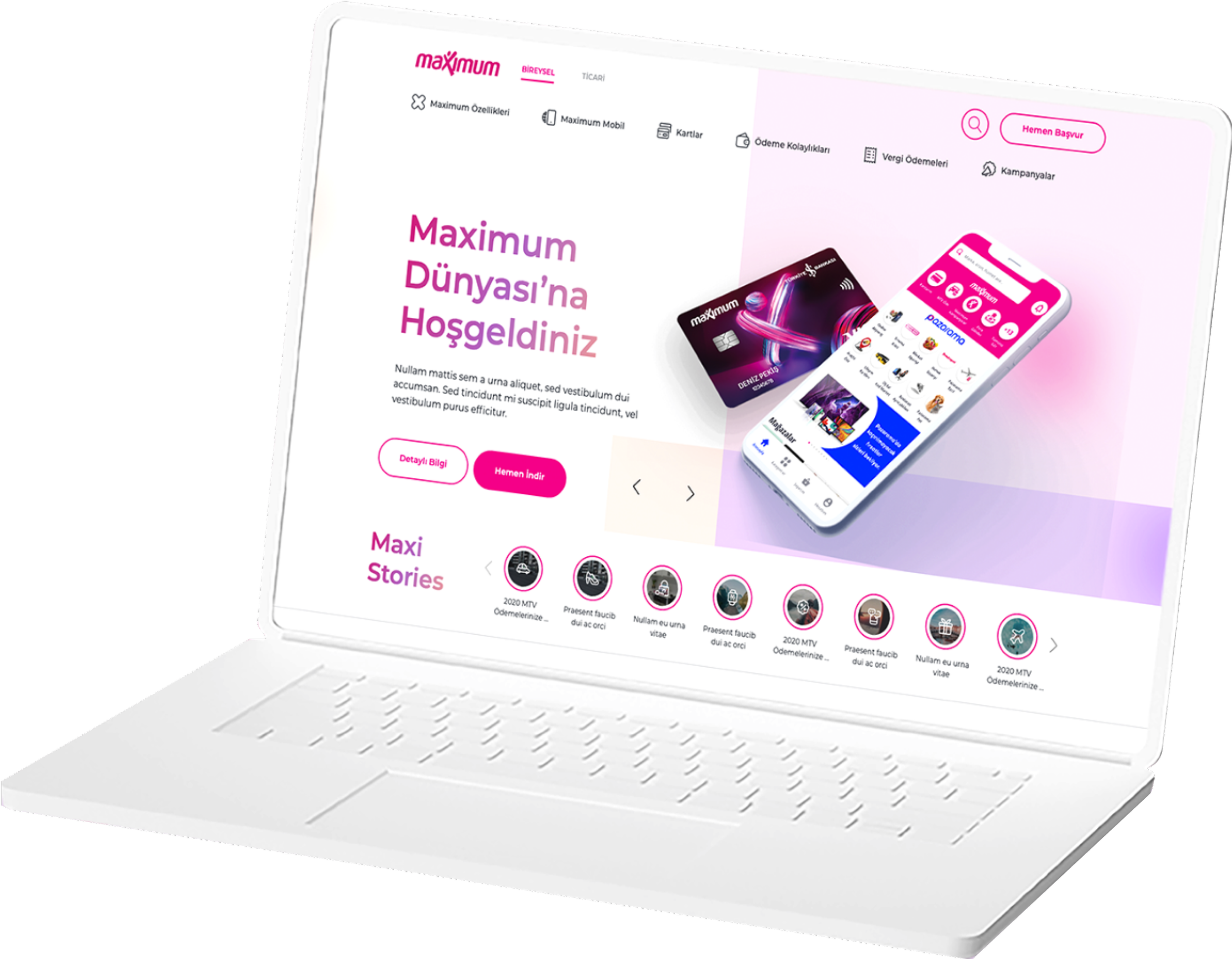
Design
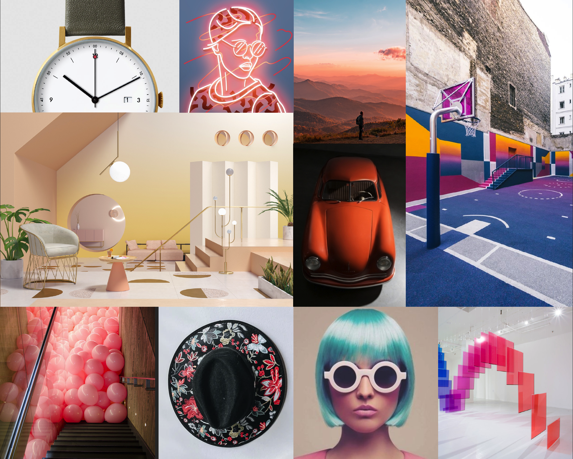
The keywords "Fun, Simplicity, Convenience, Pioneering, Individuality, Modern, Simple, and Inviting" were identified during the client strategy workshop as the primary inspiration for this design. The goal is to create a design that reflects these concepts and communicates a sense of playfulness, modernity, and convenience.
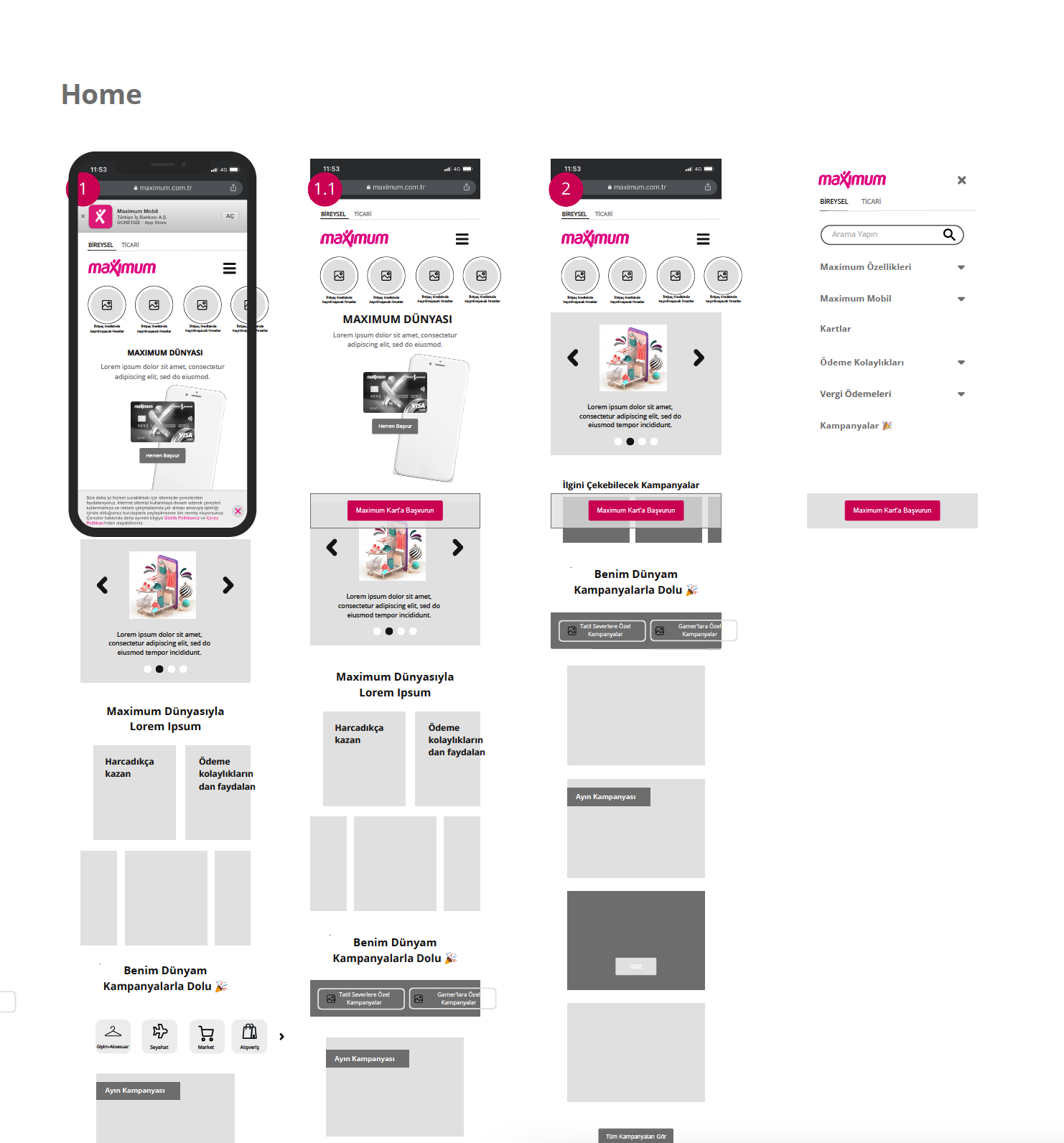
Created mid-fidelity wireframes that incorporated the design elements identified in the conceptual work. The goal was to create a simplified and intuitive user experience that effectively communicates the Maximum’s values and message across a variety of devices and screen sizes, using responsive design principles.

Based on the wireframes and the design elements identified in the conceptual work, overall design was shaped on a mobile first approach.
The design has unique patterns and contemporary illustrations to add a pioneering and dynamic element.
The color palette includes bold pink and pastel tones and other pastel colors in harmony that represent individuality and energy.
The overall goal of this design is to create a memorable and versatile identity that effectively communicates the brand's values and message across a variety of applications. The concept creation process occurred before the mid-fidelity wireframes, and the design elements identified in the conceptual work were incorporated into the wireframes and the final UI design to ensure a consistent design aesthetic.